Thoughts on Apple’s Scary Fast Event

Last night, Apple held their spooooookiest event of all time. To be fair, none of their previous events have been particularly frightening, so it was a low bar. But the start time alone was enough to have some commentators shaking their boots. Here are a few reflections on the event:

Date and time: When Apple announced an evening event a couple of days before an earnings call, I assumed this was a last-minute thing they threw together. But having seen the video now, it’s apparent that they’ve been planning it as a Halloween tie-in all along. From the evening setting to the dark backgrounds and graphics to the virtual bats flying around Apple Park, the company leaned into the theme with an earnestness only they could pull off. I thought it was fun and certainly different from anything we’ve seen before. More of this, please.

M3 Chips: It’s incredible that Apple are introducing almost the entire M3 lineup at once, and less than a year after the debut of the M2 Pro and M2 Max chips. I don’t pretend to understand all of the ins and outs, and we don’t have any reviews or benchmarks to go off of yet, but these seem like decent improvements over the previous-gen processors. If the graphics enhancements are anything like what we saw on the iPhone 15 Pro last month, these chips will be a big deal. I’m the most casual of casual gamers, and even I’ve seen noticeable impacts from the work Apple’s done on GPUs this year.

MacBook Pro: I’m so pleased with the new MacBook Pro lineup. The base model M3 version now has all of the perks that come with a modern MacBook Pro—including the new design, MagSafe charging, HDMI port, SD card slot, XDR screen, and speaker system—without the cost of including a Pro-level chip. The $1,600 starting price seems just right, and I think a lot of people will be happy to get the high-end MacBook Pro experience without paying for MacBook Pro performance.

A brighter screen is always a plus, and the Space Black finish on the Pro and Max models looks cool in the promo shots. As someone who carried a Space Black iPhone for a year, I much prefer it to Space Grey and Graphite. Would it be too much to ask for a Space Black finish in the iPad Pro line next year?

iMac: Six colors forever! The iMac was the first Mac to be redesigned specifically for Apple Silicon, and it looks stunning to this day. I still find myself admiring the iMac I keep in the living room. It’s a great computer, and when I’m not using it, it blends elegantly into my home. Apple made the right decision in bringing the M3 chip to the iMac without changing anything else. It’s a near-perfect product.

A larger iMac with a more powerful chip would be great, and I believe it’s coming. But the iMac as it stands today is the ideal consumer desktop. Now it’s even better with M3.

Lightning: It’s disappointing that Apple didn’t update the Magic Mouse, Keyboard, and Trackpad to charge via USB-C instead of Lightning. There are only a few Lightning holdouts in the lineup, but we might be stuck with the port for a while on our Mac peripherals at least.

Overall, I was surprised by how much I enjoyed the Scary Fast event. I’m not tempted to buy a new Mac right now, so I’m just a spectator, but all of these products look amazing. And the way Apple presented them was quite coherent, despite all the confusion in the rumor mill leading up to the event.

I’ll be interested to read the review of these M3-based computers once they’re out in the world starting next week. I imagine they’ll be impressive.

The next big Apple event has to be the Vision Pro release, right? I can’t wait for that one. But in the meantime, these new Macs will give us plenty to talk about.

Action Button Everywhere

I’m enamored with the new action button on my iPhone 15 Pro Max. It’s one thing to hear rumors about it or read about the possible use cases on Apple’s website; it’s another thing entirely to have it in hand. We’re still in the early days of finding out what the action button can do in the real world, but I’m going to go ahead and call it a game-changer for me.

Aside from being an awesome fidget toy, it opens up a world of possibilities for customizing my iPhone. Apple did a great job of offering a wide array of built-in options like keeping the long-standing ring switch in place, using it to activate the phone’s flashlight, or tying it to an accessibility feature. The action button settings page (which has a very “they didn’t have to go this hard but I’m glad they did” vibe) offers something useful for every iPhone user.

But the most exciting option for me, of course, was Shortcuts. That one icon in the action button menu gives users a permanent hardware trigger for automating their iPhone in any way they like. Cue the Sickos meme because I know a lot of automation die-hards who have been waiting for something like this for years. And it’s finally here!

Shortcuts lovers have already come up with a variety of ways to use the action button to automate to their heart’s content, from opening a single favorite app to crafting massive shortcuts with branching menus to hacking the button into a multi-use trigger with the help of some JSON. If you think things have gotten weird already, believe me: We’re just getting started.

Personally, I’ve been drawn in by the option to show a folder of shortcuts whenever I press the action button. This brings up a never-before-seen UI for choosing shortcuts from a menu that I find both novel and satisfying. You can show up to seven shortcuts in this new circular format, and the menu even includes a quick way to open the Shortcuts app itself.

To take advantage of this Show Folder feature, I created a new shortcuts folder called Action Button and placed the seven shortcuts I’d like to run from the action button in it. I’m still tinkering with the setup a bit, but here’s what I’ve got in there for now:

  • Photo: Open the Camera app in photo mode.

  • Video: Open the Camera app in video mode.

  • Note: Create a new note by quickly entering text into a dialogue box.

  • Reminder: Create a new task in Reminders with a task name and assigned list.

  • Transaction: Log a new transaction in my budgeting app, OpenBudget, including its amount, category, and payee.

  • Habit: Chose a habit to mark as complete in Awesome Habits, my habit tracker.

  • Day Plan: Open my day plan in Structured.

I wish I had the option to add more shortcuts here, but the Show Folder menu will only show the first seven shortcuts in a folder. Anything past that is cut off. But if you have more than seven ideas and want to try them out, you can add as many shortcuts to the folder as you want and rearrange them over time to see which you’d like to keep.

This setup is working great for me so far. I find the menu to be easy to parse quickly so I can get to the shortcut that I need, and I’m already building muscle memory so I don’t have to look as closely when activating a shortcut. I imagine the action button is going to save me a lot of time when jotting down ideas and might even keep me from missing a Kodak moment in the future with near-instant access to the camera.

After thinking this all through and trying it out for a while, I started to wish that I could have the action button on all of my devices. Many of these tasks are things that I do on my iPad, Mac, and even Apple Watch, so it would be great to have quick access to them there as well. I decided that I want an action button everywhere.

Unfortunately, I don’t have the ability to add physical buttons to my devices. (I’d probably destroy them if I tried.) But I have come up with the next best thing: a set of ways to add the action button menu to my other devices via software.

It started with—you guessed it—another shortcut. I call this one Action Button as well. (If Apple can have three different products called Apple TV, I can have both a shortcut and a folder called Action Button.) It only has three actions:

  • Get My Shortcuts with the Action Button folder chosen as the parameter

  • Choose from Menu with the result of the previous action as the parameter

  • Run Shortcut with the result of the previous action as the parameter

When I run this shortcut on any of my devices, I’m presented with a list of my action button shortcuts, and I can choose whichever one I want to run. The menu isn’t as pretty as the custom Choose Folder menu on my iPhone, but other than that, this allows me to replicate the action button experience on all of my devices. And if I ever make a change to any of the shortcuts in the Action Button folder on my phone, those changes will automatically be reflected on my other devices, too.

With that sorted, I needed to find the quickest way to run my Action Button shortcut on each of my devices. It was time to get creative.

If I had an Apple Watch Ultra, that one would be easy: I could just run the shortcut from the action button. But since I wear a Series 7, I’ll have to settle for a Shortcuts widget in my smart stack for now. If you’re wondering what happens when you try to run an unsupported action on the Apple Watch like opening the camera, don’t fret. The watch will simply show you a message that says you can’t do that.

On the iPad, there are a couple of different ways I could go about this. The fastest way would be to add a Shortcuts widget to my lock screen and set it to the Action Button shortcut. This gets as close to the action button on the iPhone as possible, but it does come with the potential downfall of the shortcut timing out. (That lock screen time limit needs to be longer.)

Another option for my iPad would be to add a small Shortcuts widget to the home screen or Today view and run the shortcut from there. I’m giving the Today view approach a try for now.

And on the Mac, I’ve tied the keyboard shortcut Option-Command-Shift-A (A for action!) to the Action Button shortcut so I can active it from anywhere. It’s quite cool pressing just a few keys and having instant access to the tasks I perform most often.

That’s how I’ve implemented my action button setup across all of my devices. Of course, I’d much rather have a physical action button to press. (Can you imagine how cool an action button would look on the side of an iPad Pro?) But for now, at least, this technique is working out for me.

Automation is one of the most powerful workflows that our devices enable for us, and having consistent automation tools across devices basically gives us superpowers. Now that I’ve gotten a taste of the action button life, I’m never going back. I want to have it everywhere, so I’ve put it everywhere. And I only hope to see the action button become a more foundational part of my workflow as time goes on.

Apple’s Color Offerings Continue to Amaze and Astonish

Apple’s big fall announcements have come and gone with new entries in both the Apple Watch and iPhone lineups. The focus, of course, was on improvements to the devices’ hardware and the capabilities enabled by those improvements. New case materials, processors, and data connectors are exciting, but I’m here to talk about the real change customers care about: color. People are passionate about the colors of their devices, and Apple always delivers an interesting mix of options. This year is no different.

First off, congratulations are in order for fans of Pink. Between Barbie and Apple’s fall hardware offering, this is your year. Pink is the featured new color for both the Apple Watch Series 9 and the iPhone 15, and I have to say it looks great. The anodized aluminum shade is clearly pink without being overstated, and the pink frosted glass back of the iPhone 15 is truly eye-catching. Apple made the right call choosing this hue to lead the lineup.

As far as the other color options for the iPhone 15, the device is available in pale shades of Blue, Green, and Yellow in addition to Black. These desaturated finishes aren’t going to please everyone, but they are sophisticated in a certain way. They’re varied enough that every customer looking to buy an iPhone 15 will find one that suits them well. The lack of a Silver finish is an odd choice, leaving Black as the only non-colorful option.

Let’s talk about Black for a second. Most products announced at the event come in some shade of black, but no two finishes are the same. Here are the different options introduced this year:

  • iPhone 15 and 15 Plus: Black

  • iPhone 15 Pro and Pro Max: Black Titanium

  • Apple Watch Series 9: Midnight (aluminum), Graphite (stainless steel), and Space Black (Hermés edition)

That’s five unique black finishes across three different product lines and three different materials. I find it interesting that the aluminum Apple Watch Series 9 continues to come in Midnight while the iPhone 15, which is also made of aluminum, is offered in a finish that is distinctly black without any hint of Midnight’s blueish undertones.

This situation makes me the miss the days when everything just came in Space Grey. Sure, it was more of a spectrum than a specific shade, but at least I knew what to call the color of my phone.

I continue to be sad that my favorite Apple Watch color, Space Black, is limited to the Hermés collection and thus starts at $1,249. That’s a high markup to get something slightly darker than Graphite. But I guess looking good comes with a price.

The Apple Watch Ultra continues to only be offered in a single Natural Titanium finish. Alas, there’s still no dark color option for the most extreme Apple Watch users. For those who like the Natural Titanium look, though, you can now buy a pro iPhone in the same finish, and it really works.

The iPhone 15 Pro also comes in Black Titanium, White Titanium, and Blue Titanium. (Have you heard the iPhone 15 Pro is made of titanium now?) The blue version is this year’s “fun” option, and it’s quite nice. It follows in the footsteps of last year’s Deep Purple by keeping things dark and muted while still clearly incorporating color.

Fans of the gold iPhone will be sorely disappointed with Apple’s new offering. It looks like gold and titanium just don’t fit well together, or at least not yet. You can still buy an Apple Watch Series 9 in a stainless steel Gold finish, but there isn’t a current-gen iPhone to match it with.

The Apple Watch Series 9 also comes in Silver, Starlight, and PRODUCT(RED) for the aluminum models, in addition to the previously-mentioned Midnight and Pink. For the stainless steel version, your options are Gold, Silver, and Graphite unless you want to pay extra for the Hermés version in Space Black.

And that’s Apple’s color story for this year. If you’re looking to color match your phone and watch, I’d recommend going with Pink for the non-pro models or Natural Titanium on the higher end. The black finishes this year are all over the place, and gold is completely missing from the iPhone lineup.

That said, most people probably don’t care as much as I do if the color of their iPhone matches perfectly with their Apple Watch. The majority of customers just want some good options to choose from so they can pick something that fits their unique style. In that regard, I think this year’s color lineup is a success.

I won’t to try make any guesses about what this set of options means for the future. Trying to predict Apple’s color offerings is a fool’s errand. Instead, we can just appreciate the chaos for what it is and spend our time arguing over which color is the best.

What Should Have Been You

Content warning: This blog posts contains references to miscarriage.

A year ago, we received the news we feared more than anything: The child we’d been expecting wasn’t going to arrive.

It hadn’t been long since we found out we were pregnant, but it had been long enough for us to dream of what our child could be. To excitedly anticipate their arrival, to calculate when their major milestones would come, to imagine what life would be like with them in our family.

Suddenly, all of that hope vanished into thin air.

In its place was a void, a hole in our hearts the precise size and shape of our love for our child. There were moments when it felt like everything we had could be swallowed by that void at any moment. We’d staked our future on this tiny person in the making, and then they were gone.

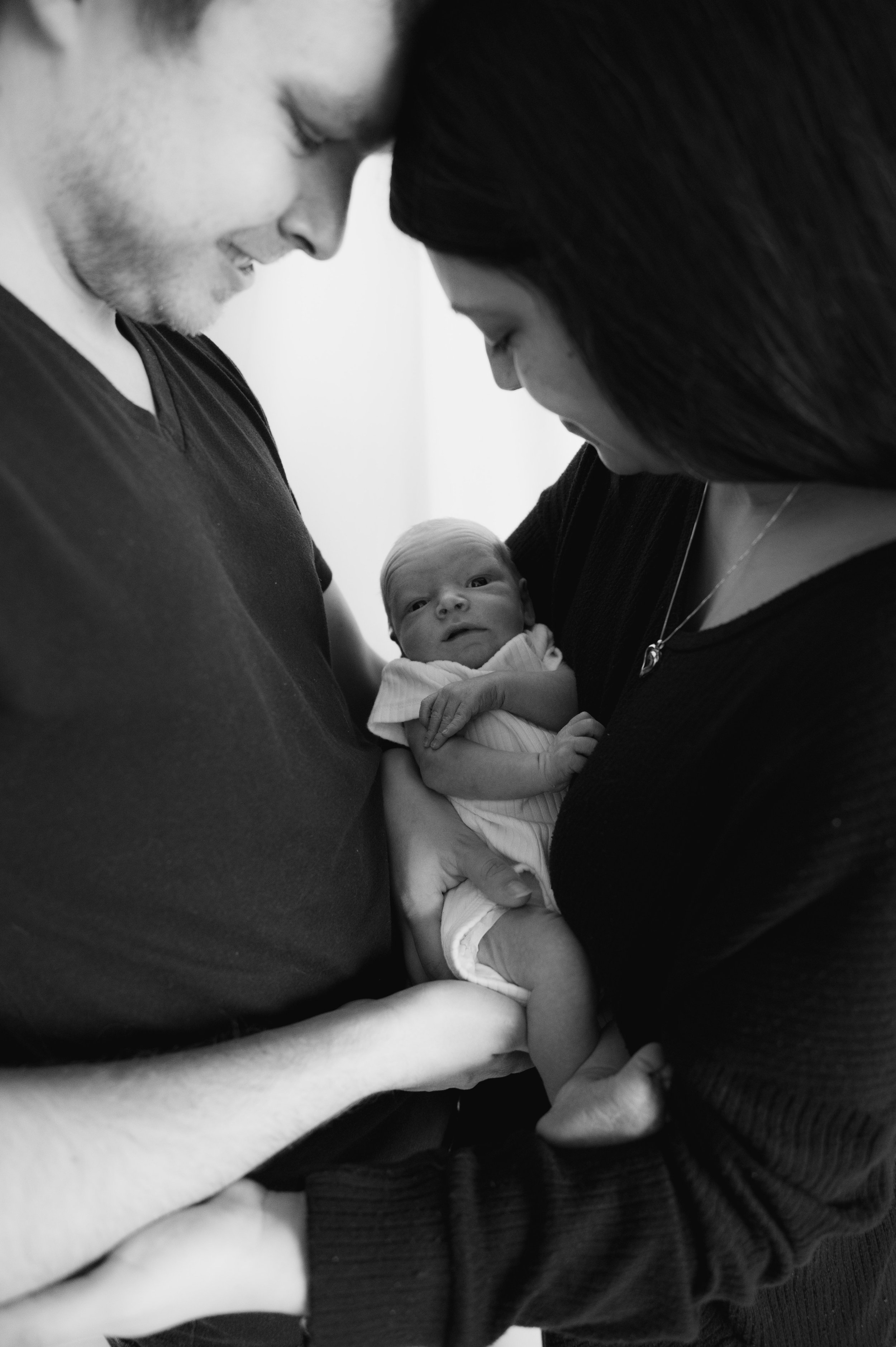
A year changes a lot of things. We are unendingly grateful for the life we have now with our son Noah. He’s the greatest blessing we could ever ask for. But we’ll never forget our little one we didn’t get to meet. They were—and always will be—bigger than the whole sky in our eyes.

Life is full of so much joy and so much pain, often at the same time. Learning to hold both is an endless endeavor, but I like to think we’ve gotten better at it over this past year. God’s faithfulness and the support of our loved ones carried us through.

To those mourning a future they thought they could depend on, to our past selves and those who find themselves in a similar place, we say this: There is life after loss. The heartache will never fully go away. It’s a part of you now, like the one you love is a part of you. You will carry them with you into tomorrow, but there will be a tomorrow. And there is always, always hope for beautiful things yet to come.

In loving memory of our unborn child. We will hold you in our hearts forever, and we will never be the same because of the time we had with you, brief as it may have been.

I've got a lot to pine about
I've got a lot to live without
I'm never gonna meet
What could've been, would've been
What should've been you